In my experience working on various residential projects, the impact of color combinations on the overall feel of a home is often underestimated. Many homeowners focus on functionality or trends, overlooking how certain colors can influence mood and perception. This is especially relevant in spaces that are frequently used or seen, such as living rooms, kitchens, and even garages.
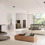
One of the most striking observations I’ve made is how well-balanced color schemes can create an inviting atmosphere without overwhelming the senses. For instance, pairing soft, muted tones with richer, deeper shades often results in a calming effect. A light sage green on the walls, complemented by darker wooden accents, can evoke a sense of tranquility while still feeling grounded. This combination works well in both indoor spaces and outdoor areas, where the natural surroundings can further enhance the effect.
Understanding the Role of Light
Lighting plays a crucial role in how colors are perceived. In environments flooded with natural light, colors can appear more vibrant, while in dimly lit spaces, they may seem duller. I’ve encountered situations where homeowners chose bold colors for a basement, only to find the space felt heavier and more confined than intended. Instead, a lighter palette with strategic dark accents can create the illusion of space, making the area feel larger and more open.
Common Overlooked Pairings
There are color combinations that tend to be overlooked but can significantly enhance a home’s aesthetic. For instance, pairing a soft beige with a muted navy can create a sophisticated yet approachable look. This combination works well in transitional spaces like hallways or entryways, where first impressions are formed. It’s easy to see how a well-thought-out color scheme can bridge different areas of the home, providing a sense of continuity.
Another frequently encountered issue is the use of too many contrasting colors, which can create visual chaos. I’ve seen this particularly in family rooms where bright primary colors dominate. While kids’ spaces can benefit from playful hues, balancing them with more subdued tones can create a more harmonious environment. For example, a bright red accent wall can be offset by softer grays or whites, grounding the space without sacrificing energy.
Wear Over Time and Color Longevity
It’s also worth noting that colors can change over time due to wear and tear. Exposure to UV light can fade certain hues, while moisture in more humid areas can lead to discoloration or even mold growth. I’ve often had to advise clients on selecting paint finishes that not only complement their color choices but also withstand the test of time. Satin finishes in high-traffic areas can provide a balance between aesthetics and durability, allowing for easier cleaning and maintenance.
Ultimately, the goal is to create a cohesive environment that feels balanced and inviting. Observing how different colors interact with each other and with the surrounding elements can lead to a more satisfying and functional space. Each home has its unique qualities, and the right color combinations can enhance those characteristics, making the space truly feel like home.